Mapping The Mighty Amazon Rainforest
Map of the Amazon Rainforest: Your Visual Guide to a Giant Green Puzzle
Open up a map of South America and look for the big green blob.
That’s the Amazon.
But that blob is hiding a lot: nine countries, thousands of rivers, hundreds of Indigenous territories, and a deforestation story that’s changing every single year. A map of the Amazon rainforest isn’t just a pretty satellite image—it’s basically a crime scene report, a climate dashboard, and a biodiversity treasure map rolled into one.
In this post, we’ll walk through what different Amazon maps actually show, how to read them, and where you can explore interactive maps yourself.

Where Is the Amazon Rainforest, Exactly?
Let’s start with the basics.
The Amazon rainforest covers about 5.5–6.7 million square kilometers (estimates vary by definition of “Amazon”), making it the largest tropical rainforest on Earth. It sprawls across nine countries:
- Brazil (by far the largest share)
- Peru
- Colombia
- Bolivia
- Venezuela
- Ecuador
- Guyana
- Suriname
- French Guiana (an overseas territory of France)
On a typical physical or political map of South America, the Amazon basin appears as a huge lowland region north of the central Brazilian highlands and south of the Guiana Highlands, centered around the Amazon River and its insane web of tributaries.

What Does a “Map of the Amazon Rainforest” Really Show?
When someone says “map of the Amazon,” they might mean several very different things. Here are the main types you’ll see:
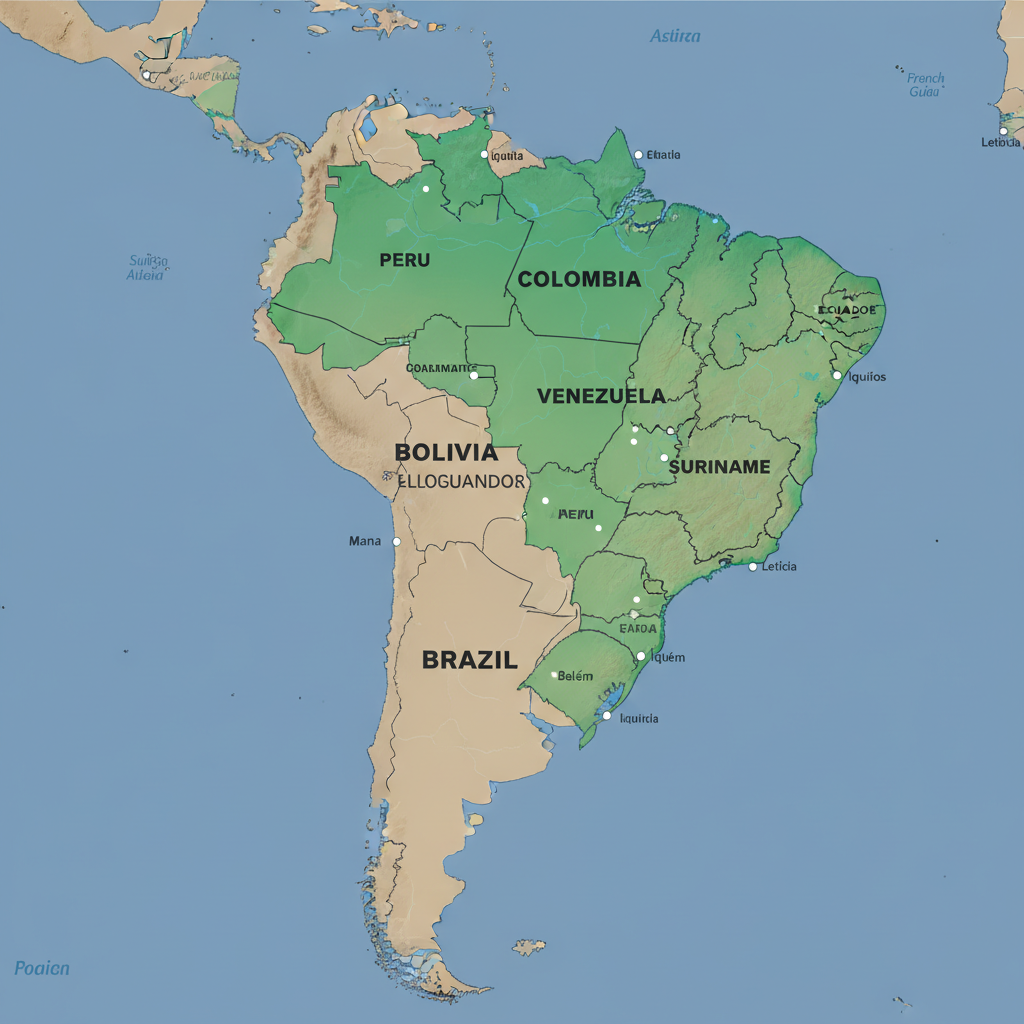
1. Political Map (Countries and Borders)
This is your classic atlas-style view.
A political map of the Amazon rainforest region shows:
- Country boundaries
- State/province lines (like Brazilian states: Amazonas, Pará, Acre, etc.)
- Major cities: Manaus, Belém, Iquitos, Leticia, Porto Velho, etc.
Use this map if you’re asking: Which country is this forest in? or How big is the Amazon part of Brazil vs Peru?
Takeaway: Great for understanding who governs what, but tells you almost nothing about forest health.
2. Biome Map (Where the Rainforest Actually Is)
A biome map shows the natural ecosystem zones, not political borders.
On an Amazon biome map, the rainforest is usually shown in a deep green area that roughly follows:
- The Amazon River basin
- Zones with tropical humid climate
- Evergreen broadleaf forest cover
These maps often distinguish between:
- Dense, closed-canopy forest
- Seasonally flooded forest (várzea & igapó)
- Savanna or forest-savanna transition zones on the edges
Takeaway: Biome maps answer the question: Where does the rainforest begin and end, ecologically—not politically?
3. Amazon River Basin (Hydrology) Map
If you’re a river nerd (no judgment), this one’s for you.
A basin map shows all the land whose rainfall drains into the Amazon River system. This basin is enormous—around 6.1–7 million km² depending on the definition—and reaches into the Andes and even small parts of other basins.
These maps typically highlight:
- The main Amazon River, from the Andes to the Atlantic
- Major tributaries: Negro, Madeira, Tapajós, Xingu, Purus, Japurá, Ucayali, Marañón, and many more
- Elevation gradients: from high Andean headwaters down to sea level in Brazil
Why it matters: Water defines the Amazon. The rainfall, river flow, and floodplains are what make true rainforest possible.
Takeaway: Basin maps show how mountains, rainfall, and rivers connect faraway regions into one giant system.
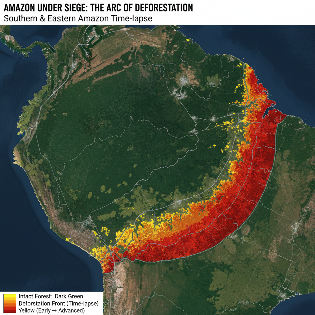
4. Forest Cover & Deforestation Maps
This is where the maps get…uncomfortable.
Modern satellite-based maps of the Amazon show:
- Intact forest (still relatively undisturbed)
- Degraded forest (logged, burned, or fragmented)
- Non-forest (pasture, cropland, urban areas)
- Year-by-year tree cover loss (where forest has recently been cut or burned)
These are usually color-coded:
- Dark green = intact forest
- Light green = secondary/regrowing forest
- Yellow/orange/red = different years of deforestation or fire-affected areas
Paired with time sliders, these maps let you watch deforestation creep along roads and rivers, forming the infamous “arc of deforestation” along the southern and eastern edges of the Amazon.
Takeaway: Forest-cover maps turn the Amazon into a time-lapse story of loss, recovery, and pressure.
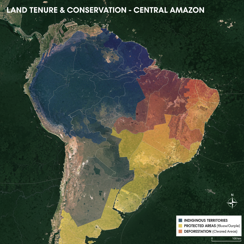
5. Indigenous Territories and Protected Areas Maps
If you only ever look at one type of map of the Amazon rainforest, make it this one.
These maps show:
- Indigenous territories (legally recognized or claimed lands)
- Protected areas (national parks, reserves, sustainable use areas)
- Overlap between Indigenous lands, protected areas, and intact forest
Pattern you’ll notice quickly: areas that remain heavily forested very often overlap with Indigenous-managed territories and conservation units.
Takeaway: This map shows that land rights and conservation are deeply linked; it’s not just “empty green space” on the map.
6. Biodiversity & Species Distribution Maps
Zoom in further and you’ll find maps that show:
- Ranges of specific species (e.g., jaguars, pink river dolphins, harpy eagles)
- Hotspots of endemism (species found nowhere else)
- Areas of high species richness (ridiculous numbers of birds, trees, insects, etc.)
These often use heatmap colors:
- Blue/green = lower diversity
- Yellow/orange/red = biodiversity hotspots
Takeaway: Biodiversity maps make the case that the Amazon is not one uniform forest—it’s a patchwork of habitats and microclimates.
How to Read an Amazon Rainforest Map Like a Pro
Instead of just staring at the green, here’s how to actually interpret what you’re seeing.
Step 1: Check the Legend
Every serious map of the Amazon will have a legend explaining the colors and symbols. Look for:
- Different greens (intact vs secondary vs degraded forest)
- Lines for roads, rivers, pipelines, and borders
- Shaded areas for Indigenous territories and protected areas
If you skip the legend, you’re basically guessing.
Step 2: Notice the Edges
Most of the forest loss happens on edges:
- Along major roads and highways (e.g., BR-163, Trans-Amazonian)
- Near cities and towns
- In arc-shaped zones in southern and eastern Amazonia
If you drag a time slider (on an interactive deforestation map), you’ll see these edges advance like a slow-moving front.
Step 3: Compare Forest Cover with Land Tenure
When you overlay:
- Deforestation data
- Indigenous territories
- Conservation units
You’ll usually see:
- Higher forest integrity inside many Indigenous territories and strictly protected areas
- More clearing outside those zones, especially on unprotected public lands and private holdings
Conclusion: who controls the land shows up very clearly on the map.
Step 4: Look Upstream and Upslope
On basin and elevation maps, you’ll see Amazon rivers starting way up in the Andes. That’s crucial because:
- Changes in Andean glaciers, rainfall, and land use affect water flow downstream
- Sediment and nutrients from mountains feed lowland ecosystems and floodplains
In other words, what happens in a high-altitude farm or mining site can eventually show up in the lowland river map thousands of miles away.
Takeaway: Good map reading = always ask, “What’s upstream of this?”
Where to Explore Interactive Maps of the Amazon Rainforest
You don’t need fancy GIS software to dive in. Many organizations offer public, interactive Amazon rainforest maps with zoom, layers, and time sliders.
Here are typical categories (you can search for these terms directly):
1. Global Forest Watch–style platforms
- Show global forest cover, loss, fires, and land use.
- Allow you to click on a specific patch of the Amazon to see how much forest has been lost over time.
2. Amazon-specific monitoring dashboards
- Focus on deforestation alerts, illegal mining, and fire hotspots across the Amazon basin.
- Often updated weekly or monthly.
3. Government mapping portals (especially Brazil and Peru)
- Offer official data on protected areas, Indigenous lands, and land use zoning in the Amazon region.
4. Academic or NGO biodiversity viewers
- Let you map species ranges, habitat suitability, and conservation priority areas.
5. Satellite imagery tools (like Earth Engine–style explorers)
- Let you scroll through cloud-free composites of the Amazon by year.
- You can literally watch a road appear, then ranches, then fragmented forest.
Pro tip: When you search, pair phrases like "Amazon rainforest map", "Amazon basin interactive map", or "Amazon deforestation map" with words like dashboard, viewer, or monitoring to find live tools instead of static images.

Three Quick Example Scenarios (So This Sticks)
Example 1: The Student Researching Deforestation
You’re writing a paper on deforestation in the Brazilian Amazon.
You pull up an interactive forest cover and tree loss map and:
- Zoom into the state of Pará
- Turn on layers for roads, annual tree cover loss, and protected areas
- Use the time slider from 2001 to 2025
You’ll see deforestation clustering along highways, then radiating outward, often stopping or slowing at the borders of certain Indigenous lands or parks.
What you learn: Road-building and land tenure are just as important as “number of trees” in your story.
Example 2: The Traveler Planning a Trip
You want to visit the Amazon but don’t want a generic “see the forest from a boat” tour.
So you:
- Open a political + biome map and identify major Amazon gateway cities: Manaus (Brazil), Iquitos (Peru), Leticia (Colombia)
- Overlay protected areas and see which parks are near each city
- Check where flooded forests vs terra firme (non-flooded) forests are mapped, to choose your preferred kind of experience
What you learn: The Amazon isn’t one single experience—map layers help you choose the kind of forest and river system you want to see.
Example 3: The Climate Nerd (Respect.)
You’re trying to understand why people call the Amazon a “carbon sink” and worry it might become a “carbon source”.
You:
- Open a forest cover map with biomass or aboveground carbon layers
- Notice darker colors (more carbon) in dense, intact rainforest areas
- Compare with deforestation maps to see where that carbon is being released
What you learn: The “Amazon and climate” debate isn’t abstract—it’s literally color-coded in maps of biomass, forest loss, and fires.
FAQs About Maps of the Amazon Rainforest
Is there one official map of the Amazon rainforest?
Nope. Different organizations define the Amazon region differently:
- Some use the drainage basin (all land where water flows into the Amazon River)
- Others use the rainforest biome (areas with a certain type of forest and climate)
- Others use a legal definition, like Brazil’s “Legal Amazon,” which is an administrative region
So two legit maps can show slightly different boundaries and still both be “right”—they’re just using different definitions.
Why do some maps show more or less forest?
Differences can come from:
- Cloud cover or satellite resolution used
- How they define “tree cover” (height thresholds, canopy density)
- How they classify plantations vs natural forest
When you compare maps from different sources, always check what they mean by ‘forest’ in the legend or metadata.
Can I download shapefiles or GIS data for the Amazon?
Yes—many scientific and government portals let you download:
- Amazon basin boundaries
- Land cover/land use maps
- Indigenous territories and protected areas
- Deforestation and fire datasets
If you’re using a GIS program (QGIS, ArcGIS, etc.), look for openly licensed data labeled as “basin shapefile,” “land cover raster,” or “protected areas polygon layer.”
How to Use Amazon Maps Responsibly
A map is never neutral. It’s a story told in colors and lines.
When you use or share a map of the Amazon rainforest:
- Check the source. Who made it? What’s their agenda or perspective?
- Look for dates. Forest and fire data age quickly—“current” often means “last year or two.”
- Respect Indigenous data. Some territorial information is sensitive; use it respectfully and cite your sources.
- Avoid oversimplifying. Saying “the Amazon is being destroyed” or “the Amazon is saved” ignores the patchwork reality the maps show.
If you’ve only ever seen the Amazon as a vague green blob, it’s worth opening an interactive map and zooming in. The story gets a lot more interesting—and a lot more real—the closer you look.
Leave a Reply