Decoding Amazon’s Button Color Palette
If you’ve ever clicked “Add to Cart” on Amazon without thinking… congratulations, you’ve just been gently herded by one of the most optimized button color palettes on the planet.
Let’s unpack why Amazon’s buttons look the way they do, what psychology is hiding underneath, and how you can steal the same principles for your own product.
What Is the Amazon Button Color Palette?
When most people think of “Amazon colors,” they picture:
- A bold yellow / orange-yellow primary button (the classic “Add to Cart”)
- A strong solid orange (often for “Buy Now”)
- A deep navy / charcoal header and nav
- Lots of white and light grays in the background
- Sparse blue for links and secondary actions
In short: bright, warm CTAs floating on a calm, low-drama background.
But this isn’t random. That yellow–orange button palette is carefully engineered to:
- Stand out from everything else on the page
- Feel urgent without feeling aggressive
- Be legible and accessible across devices
Let’s get more specific.
Amazon’s Core Button Colors (Approximate Hex Values)
Amazon constantly A/B tests, so exact values may shift slightly over time, but designers have reverse-engineered a few stable, widely used values for the Amazon-style button palette.
Here’s a practical breakdown you can use as a starting point:
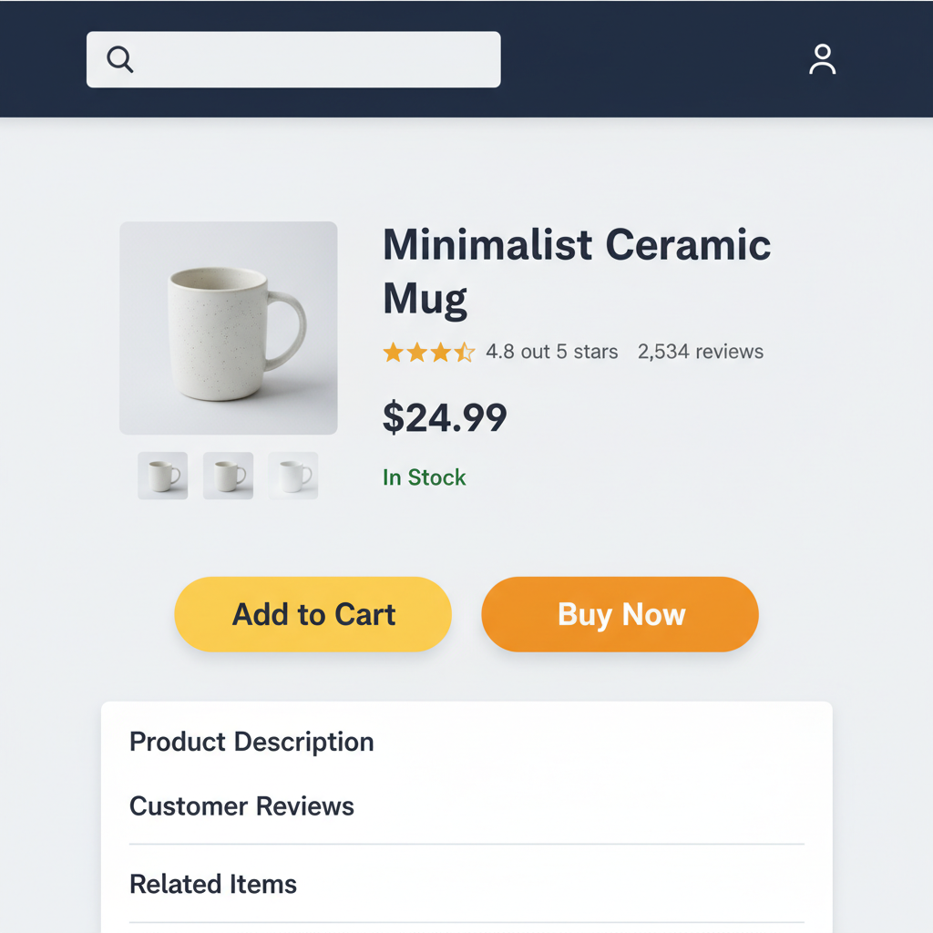
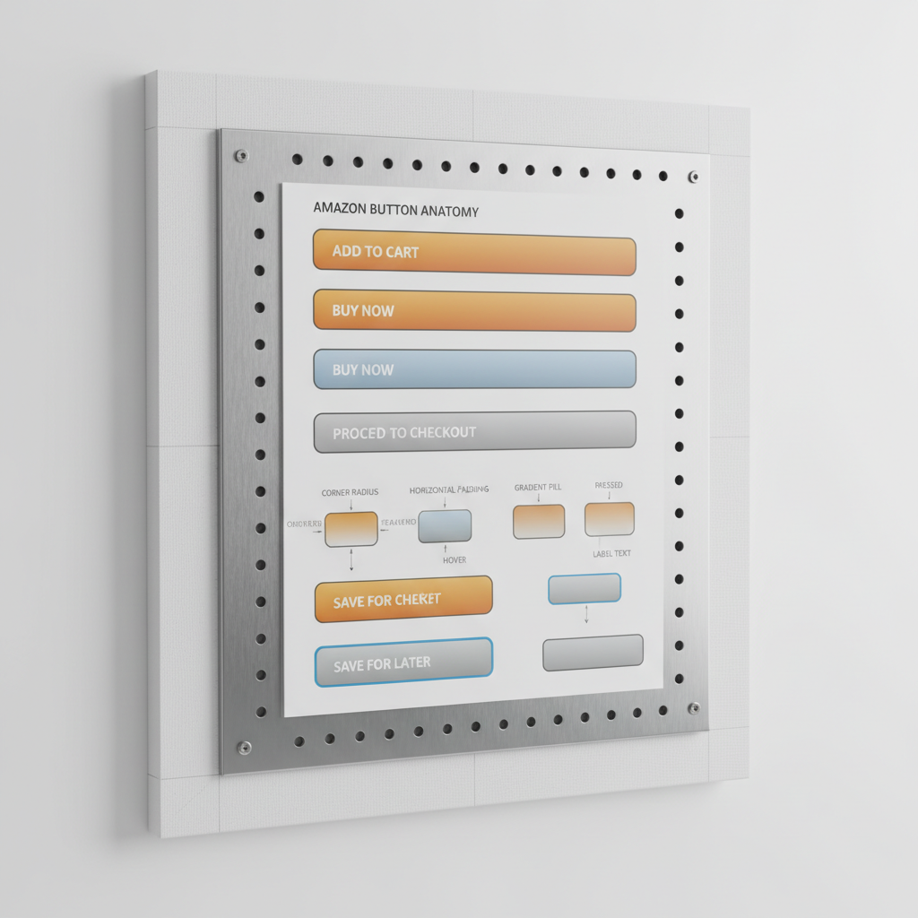
Primary “Add to Cart” Button
Often represented approximately as:
- Background:
#FFD814(Amazon-esque yellow) - Hover:
#F7CA00(slightly darker yellow) - Active/Pressed:
#F0B800(deeper, warmer yellow) - Text:
#111111or#0F1111(very dark gray, almost black) - Border:
#FCD200or a slightly darker yellow edge
This gives you that bold yellow pill-shaped CTA that screams: Click me, I’m safe and obvious.
Secondary “Buy Now” / High-Intent Button
This is usually closer to a bright orange:
- Background:
#FFA41Cor#FF9900 - Hover:
#FA8900(deepened orange) - Active:
#F08000 - Text:
#111111(again, nearly black)
Designers sometimes treat this as a more urgent or immediate action. It feels a bit hotter and more intense than yellow.
Disabled / Low Emphasis State
For disabled or unavailable states, Amazon-style buttons typically:
- Desaturate the color (pale yellow or pale gray)
- Reduce contrast with borders and text
For example:
- Background:
#F7F8FA(light gray) - Text:
#A2A6AC(muted gray)
This makes the button visible but clearly not interactive.
Why Amazon Uses Yellow and Orange for Buttons
Let’s be real: Amazon could afford any color they want.
So why these?
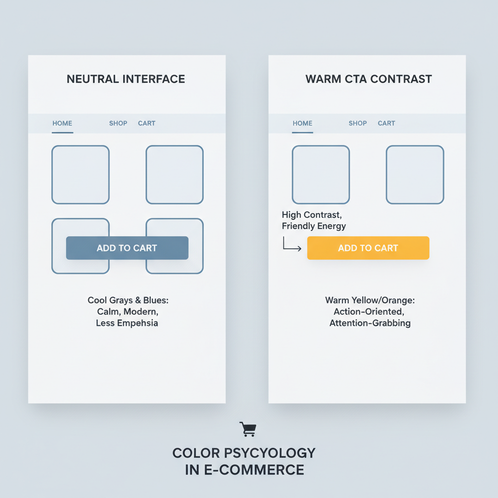
1. High Contrast Against a Neutral UI
Amazon’s layout is heavy on:
- White backgrounds
- Light gray panels
- Dark gray/black text
On that stage, a yellow or orange CTA is impossible to miss.
If their buttons were blue, they’d compete with links and other UI elements. If they were red, they’d feel like a warning. Yellow and orange sit in the perfect spot: visible, friendly, energetic.
If your UI is cool and neutral (white, gray, blue), a warm CTA (yellow/orange) will naturally stand out.
2. Warm Colors = Energy, Action, and Comfort
Color psychology is not magic, but it’s not fake either.
- Yellow is often associated with positivity, energy, and attention.
- Orange adds a sense of action and urgency, but it’s less aggressive than red.
Together, they form a spectrum that says: This is important, but not scary.
When your entire business depends on people feeling comfortable clicking purchase, that nuance matters.
Warm colors tend to feel inviting and active. They’re popular for CTAs for a reason.
3. Brand Consistency (Without Overusing the Logo Color)
Amazon’s logo famously uses black and orange, with the smile-arrow in orange.
Now imagine if the entire UI were blasting that orange everywhere. It would feel chaotic.
Instead, Amazon:
- Uses orange/yellow for high-value CTAs
- Keeps the rest of the UI muted (whites, grays, dark blues)
- Lets the CTA and logo pop without overwhelming the eyes
Your brand color doesn’t have to coat your whole UI. Use it strategically where action matters most.
Anatomy of an Amazon-Style Button
Let’s break down what makes an Amazon-like button feel like Amazon, beyond just color values.
1. Shape and Spacing
- Rounded corners but not overly pill-like
- Generous padding on left and right (feels tappable on mobile)
- Clear separation from surrounding elements (margin/whitespace)
It looks like a button, not a simple text label with a border.
2. Subtle Depth
Amazon buttons often have:
- A slight gradient or light-to-dark effect
- A border that’s 1 shade darker than the background
That tiny hint of depth helps signal “this is clickable” without full-on skeuomorphism.
3. Clear, Short Labels
- “Add to Cart”
- “Buy Now”
- “Proceed to Checkout”
No fluff. No clever puns. Just clear intent.
You can copy every hex code from Amazon and still fail if your buttons look cramped, flat, or unclear. Typography, spacing, and affordance matter just as much.
Example: Simple Amazon-Inspired Button Styles (CSS)
Here’s a minimal CSS snippet to get an Amazon-style color palette for your buttons:
:root {
  --amazon-yellow: #ffd814;
  --amazon-yellow-hover: #f7ca00;
  --amazon-yellow-active: #f0b800;
  --amazon-orange: #ffa41c;
  --amazon-orange-hover: #fa8900;
  --amazon-orange-active: #f08000;
  --amazon-text-dark: #111111;
}

.btn-amazon-primary {
  background: var(--amazon-yellow);
  color: var(--amazon-text-dark);
  border: 1px solid #fcd200;
  border-radius: 999px;
  padding: 0.6rem 1.6rem;
  font-weight: 500;
  cursor: pointer;
}

.btn-amazon-primary:hover {
  background: var(--amazon-yellow-hover);
}

.btn-amazon-primary:active {
  background: var(--amazon-yellow-active);
}

.btn-amazon-buy-now {
  background: var(--amazon-orange);
  color: var(--amazon-text-dark);
  border: 1px solid #e08600;
  border-radius: 999px;
  padding: 0.6rem 1.6rem;
  font-weight: 600;
  cursor: pointer;
}

.btn-amazon-buy-now:hover {
  background: var(--amazon-orange-hover);
}

.btn-amazon-buy-now:active {
  background: var(--amazon-orange-active);
}
You can tweak radius, padding, and fonts to match your product, but this gives you a quick starting point.
How to Design Your Own “Amazon-Like” Button Palette (Without Copying)
You don’t need to clone Amazon to learn from it. Here’s a simple process.
1. Start With Your Brand Color Strategy
Ask:
- What is my primary brand color?
- Is it warm (red/orange/yellow) or cool (blue/green/purple)?
- What emotion do I want for my primary action: urgent, calm, premium, playful?
If your brand is blue, it might be smart to:
- Use blue for headers/nav
- Use orange/yellow as a high-contrast CTA
If your brand is already warm, you may need a more neutral UI so the buttons don’t blend in.
2. Build a Contrast-First Palette
For each button state, define:
- Background color (main fill)
- Text color (must pass accessibility contrast, ideally WCAG AA or better)
- Border color (slightly darker or lighter variant)
- Hover/active state colors (1–2 steps darker or lighter)
Test your colors on:
- Light backgrounds
- Dark text around them
- Both desktop and mobile mockups
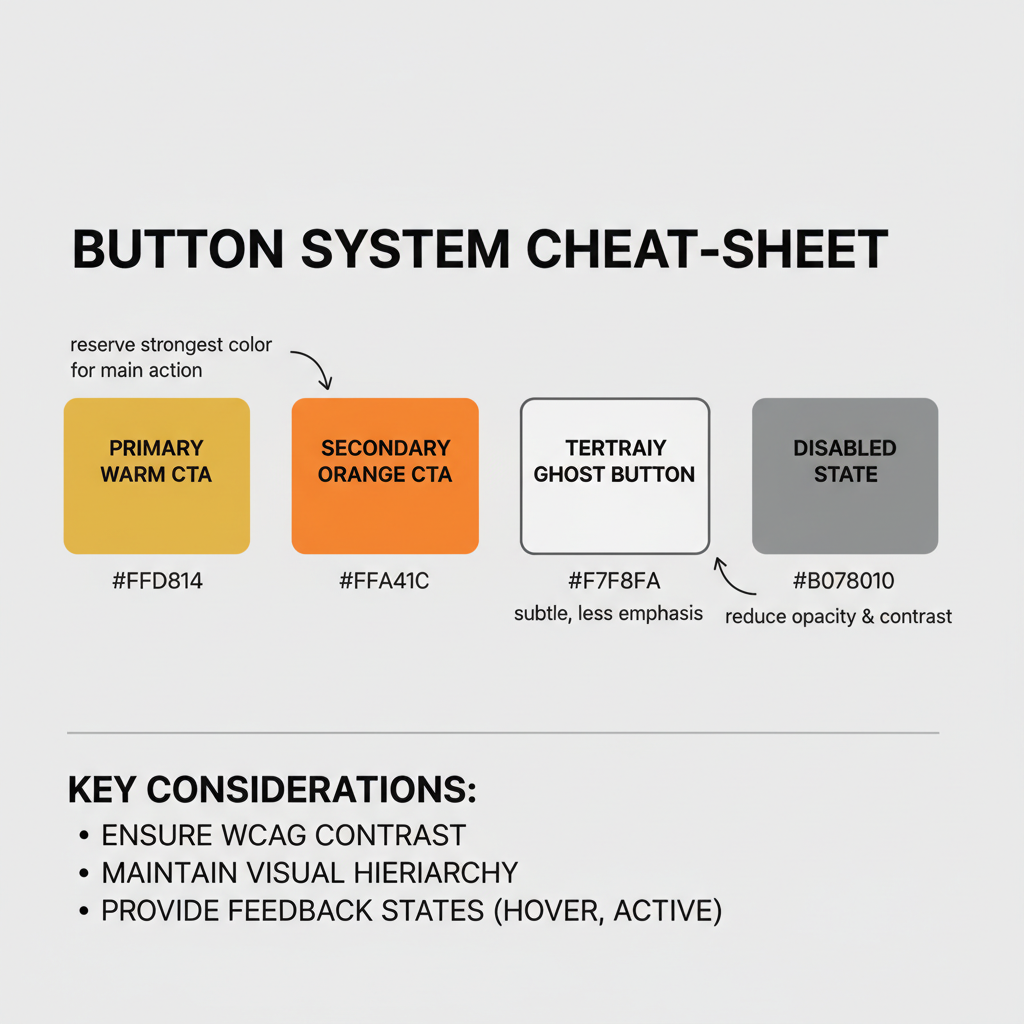
3. Define Button Types and Hierarchy
Amazon doesn’t just have “a button.” It has a system.
You’ll usually want at least:
- Primary CTA – main action (purchase, subscribe, start trial)
- Secondary CTA – alternative but important action (learn more, add to wishlist)
- Tertiary / Ghost Button – low-priority or outline-only actions
- Disabled State – visible but clearly unavailable
Give each a consistent:
- Color
- Weight (fill vs outline)
- Position
This prevents your UI from turning into a “button salad.”
4. Test With Real Content, Not Just Dribbble Shots
Buttons that look pretty in a Figma shot can die quickly in real life.
Test your Amazon-style palette on:
- Crowded product pages
- Mobile views with long forms
- Dark mode (if you support it)
Watch for:
- Do people instantly recognize what’s clickable?
- Is there ever a moment where the user wonders, “Where do I go next?”
If so, your buttons aren’t loud enough—or there’s too much competing noise on the page.
Common Mistakes When Copying the Amazon Button Palette
Stealing the hex codes is easy. Getting the effect is harder.
Mistake 1: Using Amazon Yellow on an Already Warm UI
If your site already uses lots of reds, oranges, or yellows, an Amazon-style yellow button might disappear into the chaos.
Instead, consider:
- Cool neutrals for the base UI
- Warm CTAs
Or flip it:
- Warm brand visuals
- Cool, high-contrast CTA like teal or blue
Mistake 2: Overusing the CTA Color Everywhere
If everything is yellow or orange—badges, alerts, highlights—the button stops being special.
Reserve the strongest warm color for your primary action only. Use softer or more neutral tones for supporting elements.
Mistake 3: Neglecting Accessibility
A bright yellow button with light gray text? Looks cute. Fails users.
Always ensure:
- Button text has strong contrast against the background
- Focus states (for keyboard users) are clearly visible
- Hover and active states are distinguishable, not just microscopic hue shifts
Quick Reference: Amazon-Inspired Button Color Palette
Here’s a compact cheat sheet you can adapt:
Primary CTA (Add to Cart style)
- Background:
#FFD814 - Hover:
#F7CA00 - Active:
#F0B800 - Text:
#111111 - Border:
#FCD200
Secondary CTA (Buy Now style)
- Background:
#FFA41C - Hover:
#FA8900 - Active:
#F08000 - Text:
#111111 - Border:
#E08600
Disabled
- Background:
#F7F8FA - Text:
#A2A6AC - Border:
#D5D9D9
Tweak saturation and brightness to fit your brand, but keep the high contrast + warm-on-neutral logic.
Final Thoughts: Don’t Just Copy Amazon—Think Like Them
Amazon’s button color palette works not because yellow is “magic,” but because it’s:
- High-contrast against a quiet interface
- Warm and inviting instead of alarming
- Used consistently and sparingly for the most important actions
If you want Amazon-level performance, don’t just chase their colors.
Chase their discipline:
- Clear visual hierarchy
- Relentless testing
- Systems over vibes
Use the palette ideas in this post as a starting point—but let your own brand and users have the final say.
Leave a Reply