The Story Behind The Amazon Music Logo
If you’ve ever squinted at the Amazon Music app and thought, “Okay but… what is that logo supposed to be?”—you’re not alone.
Let’s unpack what’s actually going on with the Amazon Music logo, why it looks the way it does, and how it’s evolved as Amazon turned from a book seller into a full‑blown streaming giant.
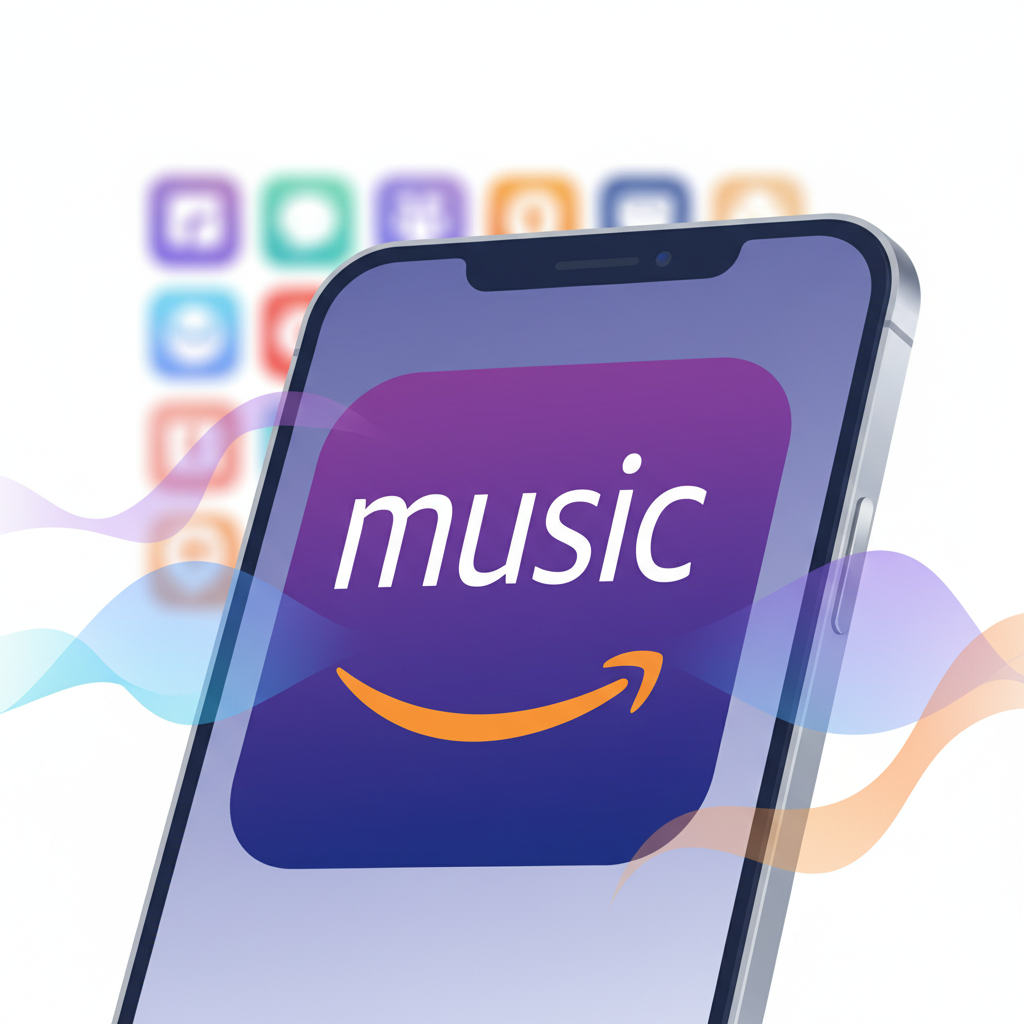
What Is the Amazon Music Logo, Exactly?
The current Amazon Music logo is a combination of three core elements:
- The wordmark – the word “amazon” in lowercase, using Amazon’s familiar custom sans‑serif typeface.
- The smile/arrow – that curved orange arrow that goes from the “a” to the “z.”
- The “music” tag – usually the word “music” in a clean, modern font, often in purple or white depending on background.
On the app icon, you’ll typically see a solid background (often a gradient purple or blue) with:
- The Amazon smile centered or aligned low
- The word “music” above it in white or light text
So no, you’re not missing some secret vinyl record or guitar pick shape. The logo is mostly type + symbol, built around the global recognition of Amazon’s smile.
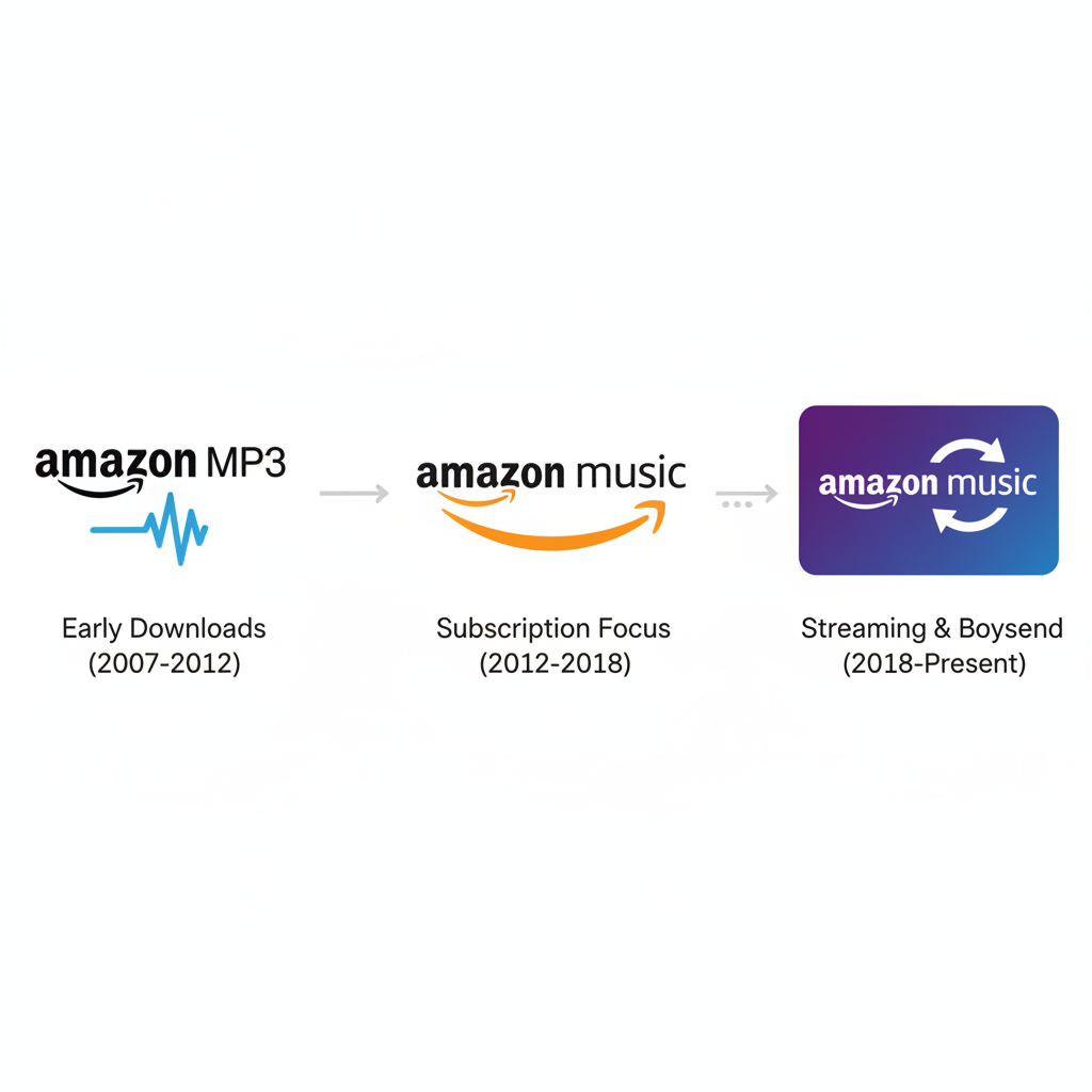
A Quick Visual Evolution of the Amazon Music Logo
Amazon Music has gone through a few visual phases as its product lineup shifted:
1. Early “Amazon MP3” Era
Back when streaming wasn’t the default, Amazon leaned on “Amazon MP3” as a music store brand. Logos from this period:
- Used more literal music references (waveforms, “MP3” text)
- Looked more like a download shop than a streaming app
This was the iTunes competitor era: buy, download, own.
2. Transition to “Amazon Music”
As streaming took over, Amazon dropped “MP3” and moved to the simpler “Amazon Music” naming. The logo:
- Centered the Amazon smile as the anchor
- Simplified to clean typography, less decoration
- Started aligning visually with other Amazon services (like Prime Video)
3. The Modern Streaming + Brand Ecosystem Look
Today’s Amazon Music logo fits into a unified Amazon entertainment family:
- Strong, flat colors or subtle gradients
- Minimalist, sans‑serif type
- The same smile/arrow that you see on the main Amazon logo

Why the Amazon Smile Matters So Much in the Logo
The single most important visual element in the Amazon Music logo isn’t the word “music.” It’s the smile/arrow.
That little curved arrow does three things at once:
- Brand recognition – You instantly know this is an Amazon product, not some random purple music app.
- Brand promise – The smile implies happiness, satisfaction, and friendly service.
- Hidden idea – It goes from “a” to “z”, suggesting Amazon has everything. Applied to music, it subtly hints: we have everything you want to hear.
In the tight real estate of an app icon, Amazon doesn’t try to cram in instruments, notes, or waveforms. They let the smile carry the whole brand story.
Color Choices: Why So Much Purple and Blue?
Scroll through your phone and you’ll notice a pattern: a lot of entertainment and social apps are blue or purple. Amazon Music leans into this with:
- Purple/indigo gradients for feeling modern, digital, and a bit premium
- White text for clear contrast
- The orange smile (when used) as a small but memorable accent
The palette does a few smart things:
- Separates it from Amazon’s shopping green/orange/black look, so it feels like entertainment—not e‑commerce.
- Keeps consistency with Amazon’s other media brands like Prime Video, which also use bold colors and simple type.
- Stays visible on both light and dark backgrounds in OS app grids.
Logo Variations: Amazon Music vs. Amazon Music Unlimited vs. Prime
If you follow Amazon Music closely, you’ll notice small logo and lockup variations depending on the service tier:
- Amazon Music (free / basic) – Standard logo: “music” + smile, typical brand colors.
- Amazon Music Unlimited – Often similar logo but paired with the word “Unlimited”, or used in marketing graphics to emphasize a bigger catalog and premium tier.
- Prime + Amazon Music – In some placements, the Prime logo appears alongside or above the Amazon Music mark to show it’s part of the Prime membership bundle.
On your home screen, though, Amazon keeps it simple. You mostly see just one main Amazon Music app icon, not different icons for each tier. The differences show up more in ads, banners, and subscription pages.
Design Elements That Make the Amazon Music Logo Work
Let’s break down the logo like a designer for a second.
1. Typography
- Lowercase “amazon”: friendly, approachable, not shouty.
- Simple sans‑serif “music”: modern and legible even at very small sizes.
- No scripts, no wild letterforms—because this has to work on everything from phones to TVs.
2. Simplicity for Tiny Screens
The app icon and in‑player UI are often seen at very small sizes. That means:
- No fine lines or detailed graphic shapes
- Just bold color + clear letters + one recognizable symbol
The logo still reads when:
- It’s on a smart TV home screen across the room
- It’s a little icon in your notification tray
- It’s compressed in a tiny corner of a car display
3. Consistency Across Devices
You’ll see the Amazon Music logo on:
- Smart TVs and streaming sticks
- Smart speakers and displays
- Car dashboards
- Mobile and desktop
The design is flat and flexible, which makes it easier to keep one cohesive look no matter the platform.
What the Amazon Music Logo Communicates About the Brand
Whether you consciously notice it or not, the logo is sending a handful of signals about what Amazon wants you to believe:
- “We’re part of something big.” The shared Amazon smile ties music to shipping, smart devices, video, and more.
- “We’re reliable and familiar.” No experimental weirdness—just a stable, corporate‑clean design.
- “We’re here to be your default.” The logo doesn’t scream niche or indie. It feels mainstream on purpose.
In a world where Spotify leans into mood and personalization, and Apple Music leans into slick minimalism and hardware integration, Amazon Music’s logo leans into ecosystem power. It says, “If you already live in the Amazon world, we’re the obvious music choice.”
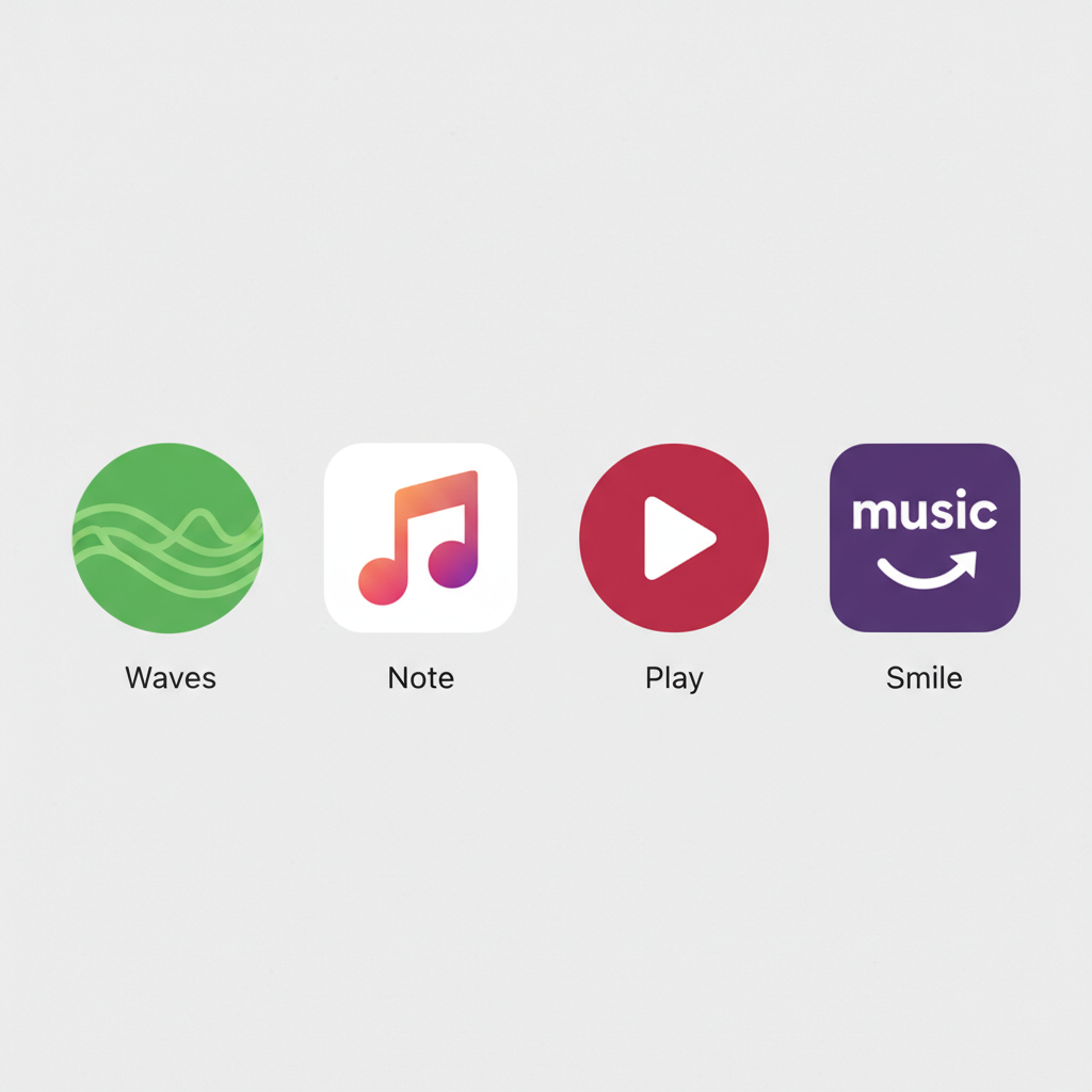
How the Amazon Music Logo Compares to Other Streaming Logos
Let’s line it up mentally against a few competitors:
- Spotify: Green circle with sound waves. Strongly music‑coded.
- Apple Music: Musical note on white or gradient background. Clean, hardware‑friendly.
- YouTube Music: Play‑button circle motif. Feels like a cousin to classic YouTube.
- Amazon Music: Wordmark + Amazon smile on a colored background. Brand‑first, not music‑first.
Amazon is effectively saying:
“You already trust us for shopping, delivery, and devices—this is just another thing we do well.”
That’s a strategic choice. Instead of trying to be the coolest music brand, Amazon aims to be the most integrated music brand.
If You’re Designing Something Inspired by the Amazon Music Logo
Maybe you’re:
- Designing a music app UI mockup
- Creating brand‑aligned graphics for an Amazon Music promotion
- Just studying big‑tech branding for inspiration
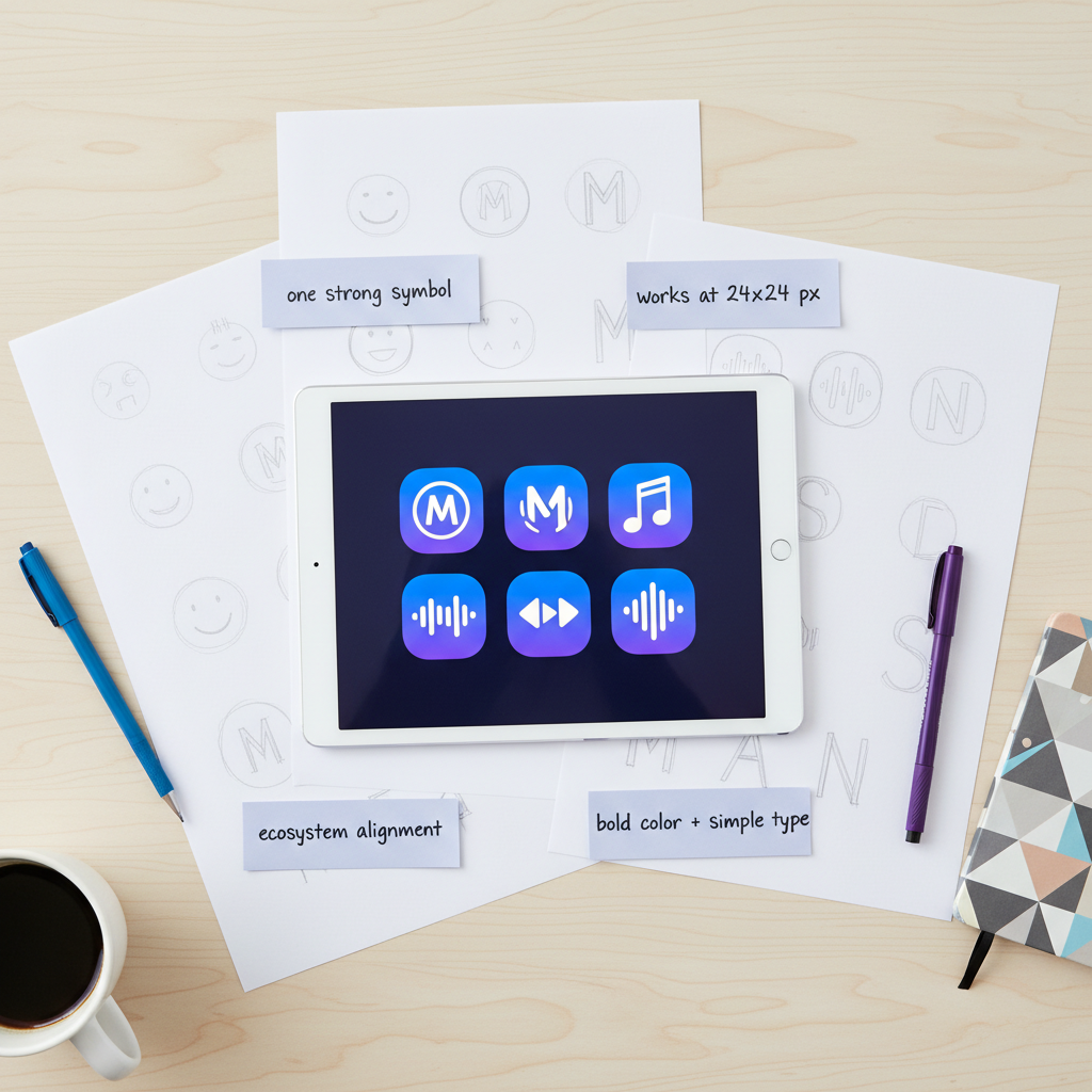
Here are a few guidelines you can steal from the Amazon Music logo playbook:
- Lead with one powerful symbol. For Amazon, it’s the smile. For you, it could be a mark, monogram, or single simple icon.
- Keep text minimal and legible. No more than a single short word if it has to fit in an icon.
- Use color to set the mood, not tell the whole story. One or two core colors + neutral text is usually enough.
- Design for the smallest size first. If it works at 24×24 pixels, it will work everywhere.
- Align with your ecosystem. If your app or service is part of a bigger family, echo shared shapes, colors, or symbols.
Final Thoughts: Why the Amazon Music Logo Works
The Amazon Music logo might not be the most artistic or dramatic design in the streaming world, but it doesn’t need to be.
It works because it is:
- Instantly recognizable through the Amazon smile
- Visually consistent with the rest of Amazon’s ecosystem
- Simple and legible on any screen, any distance
- Flexible enough for different tiers and marketing uses
Next time you scroll past that purple‑and‑smile icon on your phone, you’ll know there’s more strategy behind it than just “throw the Amazon logo on a purple background and ship it.”
And if you’re working on your own logo or brand identity, the Amazon Music logo is a reminder that:
Strong brand systems beat flashy one‑off designs—especially in a world full of tiny app icons.
Leave a Reply